4Geeks Design System
A living reference for the visual language, tokens, and components that power the 4Geeks product — from the platform to marketing across 6 countries.
How it came together
Two live surfaces. No system. One designer. The challenge wasn't just creating consistency — it was doing it without disrupting a platform already in daily use by students and mentors.
Audit first, assumptions second
I went through both the public site and the internal platform screen by screen, cataloguing every button variant, color value, and spacing decision that had accumulated without a system. The two surfaces had diverged: the same UI action could look completely different depending on where you encountered it.
Build what matters most, first
With a live platform already running, I couldn't redesign everything at once. I cross-referenced the audit against comparable products — Duolingo, Coursera — to identify which components that carried the most weight. Build order went from universal and high-frequency (buttons, typography, tokens) down to specialized (course cards, modals, mentor UI). The team had usable foundations early; the platform absorbed the system gradually.
120 components, every state documented
Each component was built in Figma with all states — default, hover, disabled, error — and documented with context: when to use a primary button vs a ghost, which pill maps to which status, how navigation differs between surfaces. Not a library for designers. A reference developers could open and implement directly, without back and forth.
Handoff that removed me as a bottleneck
The system is now the single source of truth for a 10-person dev team. Developers make UI decisions independently — and those decisions land consistently. The system didn't just create visual consistency. It removed me as a bottleneck.
Colors
Built around a bold primary blue. Semantic colors carry clear meaning — green for success, yellow for warnings, red for errors.
Brand
Semantic
Neutral
Typography
Lato is the single typeface across the entire 4Geeks product. Two weights carry everything — Regular for reading, Bold for action and hierarchy.
Google Fonts · sans-serif
The only typeface in the system
Body copy, descriptions,
labels, captions, pill text
Headings, buttons, CTAs,
counters, emphasis
Spacing
A 4px base scale. All layout spacing, padding, and gaps use values from this scale.
Border radius
No sharp corners anywhere in the UI. Every surface is rounded — scale from subtle (buttons, inputs) to generous (cards) to full (pills, badges). The rounder the shape, the less interactive it feels.
Pills & tags
Used to label, categorise, or convey status. Full-radius always signals informational — never interactive.
Navigation
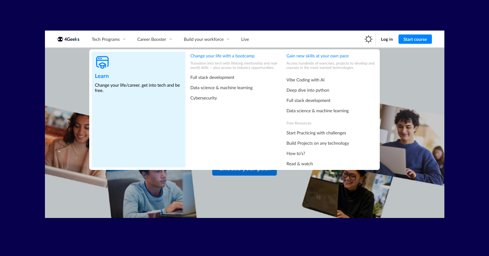
4Geeks offers bootcamps, self-paced courses, career programs, live events, and free resources — all competing for space in a single nav bar. The original structure couldn't hold it. Before touching any UI, we mapped the full content inventory and ran a card sorting exercise to find the real mental models. The result was a mega menu: one controlled expansion that surfaces the full catalog without overwhelming the default state.
Avatar
Appears wherever a user has presence — top nav, leaderboards, comments, course context. Three sizes, two fallback patterns (photo / initials), and two indicator types (online status dot, notification badge).
Course cards
Program cards adapt their color theme to the course category. The colored header carries the course identity; pills and CTA stay consistent across variants.
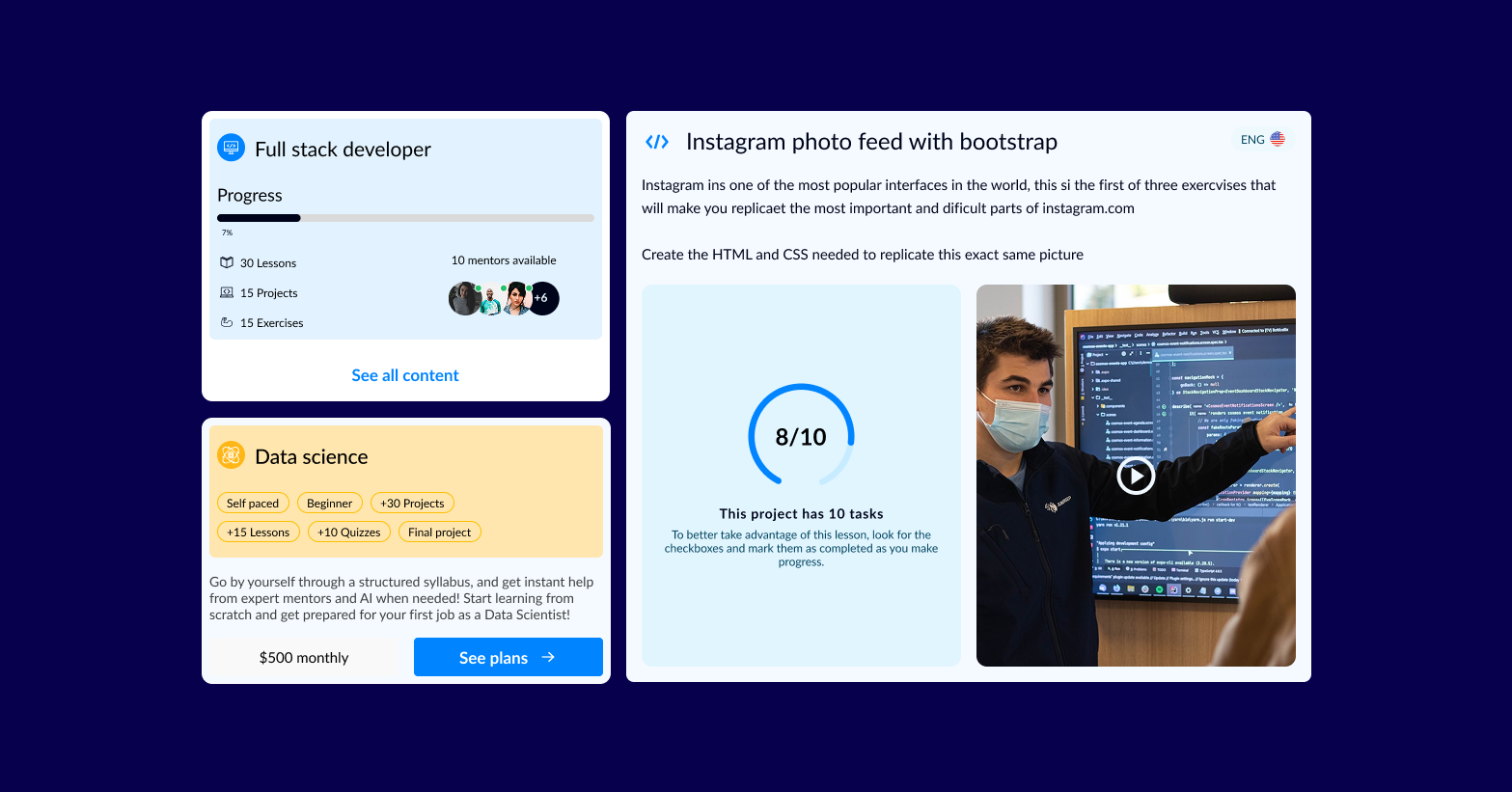
Asset cards
Used for lessons, projects, and exercises across the platform. Status, duration, and tech tags adapt per content type.
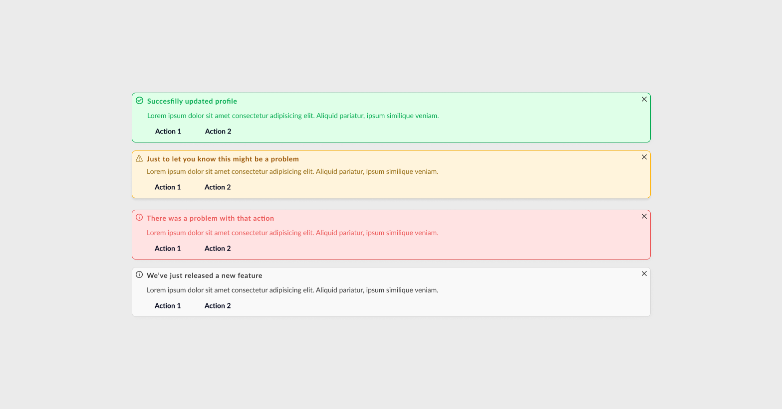
Alerts
System-level feedback for actions and states. Four semantic variants map directly to the color tokens — success, warning, error, and info. Each can carry optional actions and is always dismissible.
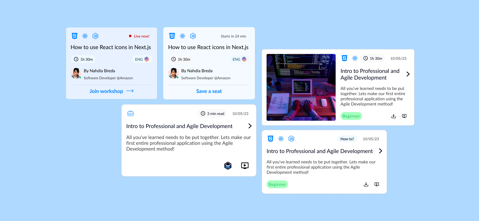
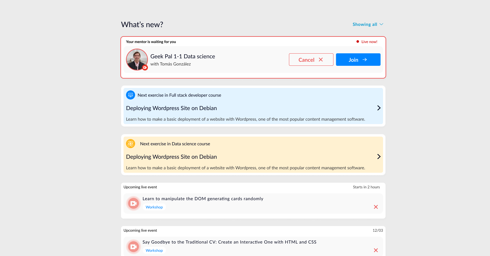
System notifications
Real-time updates surfaced across the platform — upcoming live sessions, mentor messages, course progress nudges, and enrollment reminders. Priority determines placement and urgency styling.
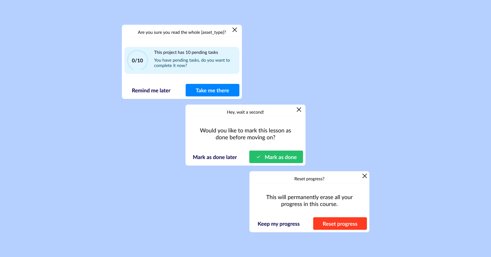
Modals
Indicative modals surface time-sensitive actions — surveys, progress checks, and completion prompts. Ghost action dismisses; primary action commits.