
4Geeks: Building a visual identity that bridges coding with people
4Geeks is a coding academy operating across 6 countries — bootcamps, unlimited mentorship, and a community built around the idea that a tech career should be within reach for anyone who wants it. Forbes-listed, learner-first.
The problem
4Geeks had been running for years with a brand that grew organically — not broken, just uneven. An active student base, a team of engineers who'd never worked with a designer, and a logo the founders were attached to.
The challenge wasn't just what to design. It was convincing the team that redesigning it was worth doing at all.
Refreshing the brand
We pushed the palette toward something more alive — brighter, warmer, less corporate. The typeface was chosen for density: it had to survive course cards, long tables, and crowded dashboards. The mascot icon was rebuilt from scratch to carry energy without competing with everything around it.
We chose to evolve the existing identity rather than start from scratch — preserving brand recognition with the existing community while modernizing the visual language to match where 4Geeks was heading.
 Icon
Icon


The "average student" doesn't exist.
YOU do — with your unique strengths, weaknesses, and learning style.
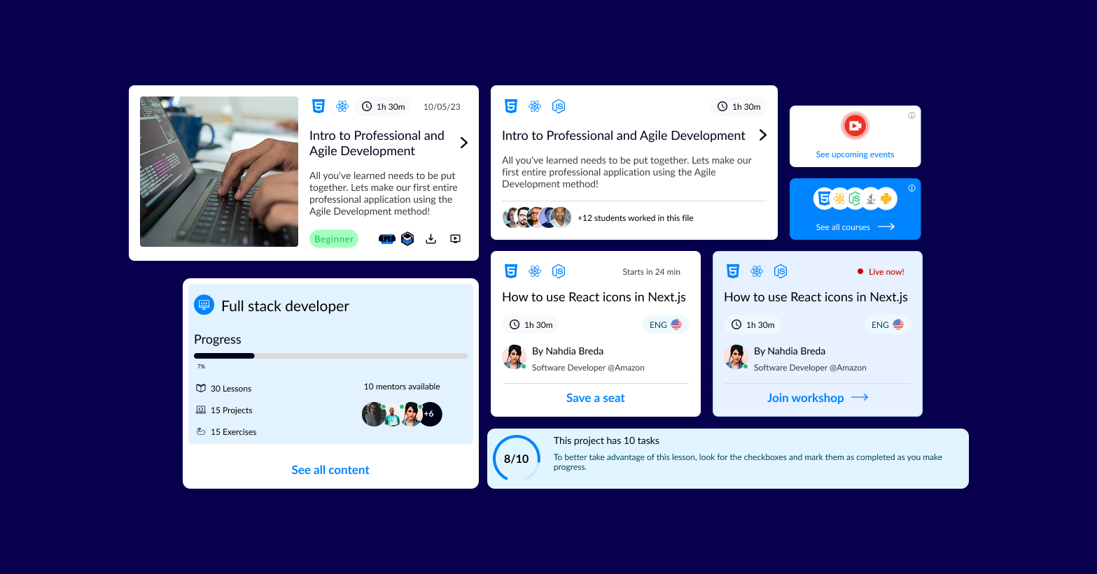
Design system
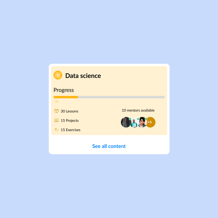
The system had to work for engineers who'd never used one. So before building any components, we agreed on three rules: rounded corners mean clickable, blue means primary action, full-radius means informational. Once those held, engineers could build correctly even before the component library was finished.
The system was built to be adopted by a team with no prior design culture — so simplicity of the decision logic mattered as much as the components themselves. Shape (rounded = clickable), color (blue = primary action), and density rules were defined first, so engineers could build correctly before the component library was complete.
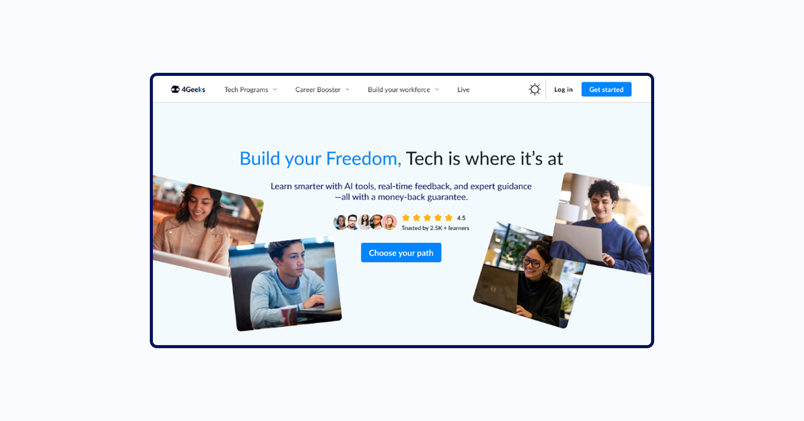
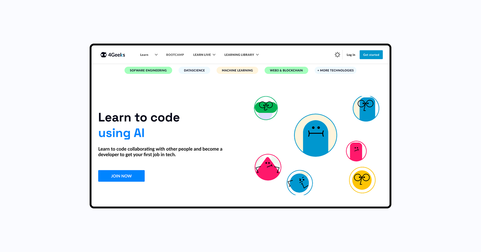
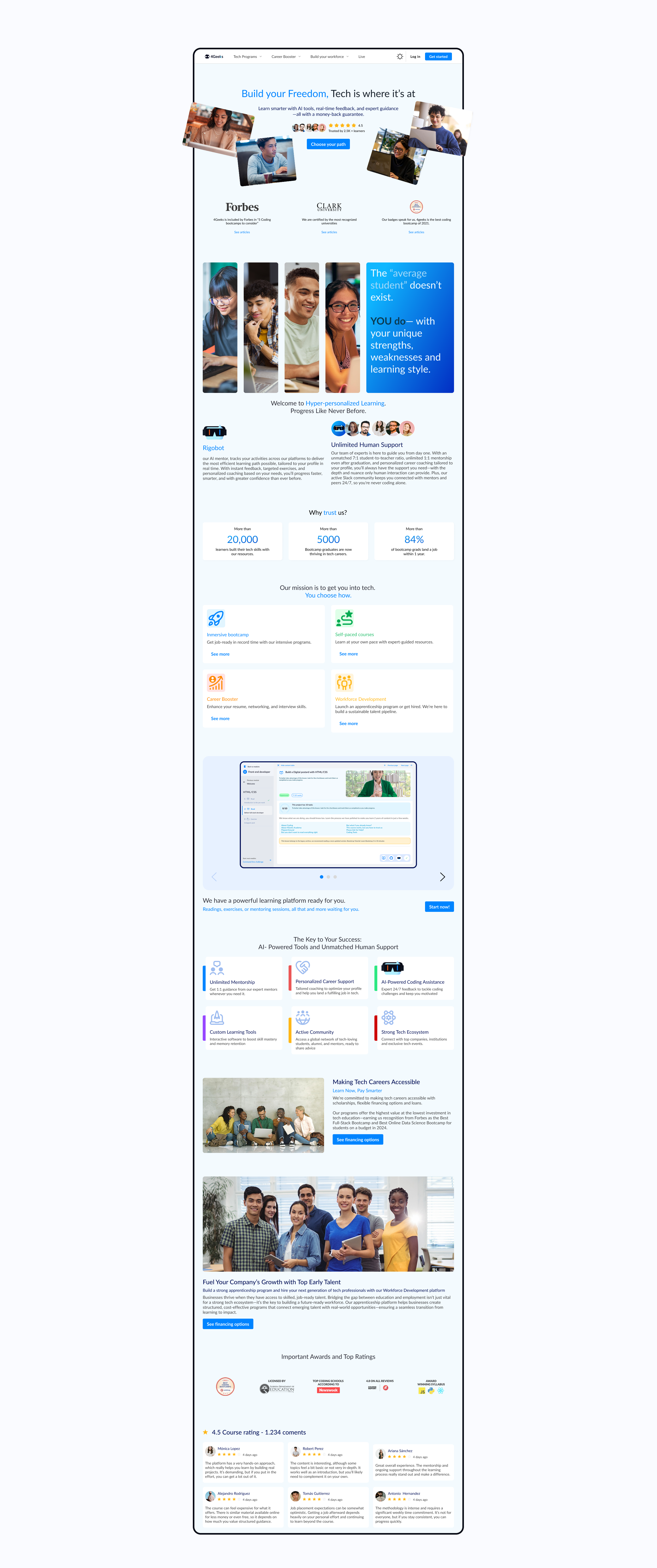
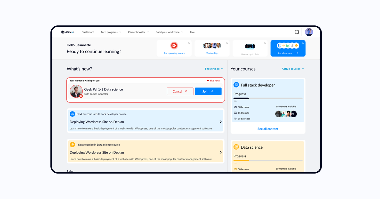
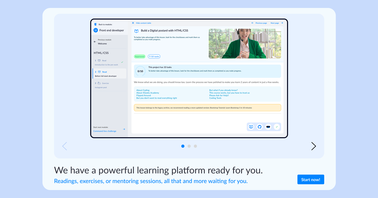
Website & platform
The homepage needed to do three things at once: speak to a first-timer, reassure a skeptic, and not bore someone who'd seen fifty coding bootcamp sites. But the bigger problem was the platform itself — thousands of students already using it, no clean-slate option.
With an active user base, a full redesign launch wasn't an option. We built a template-first approach — defining flexible layout patterns in the design system that could be applied section by section, shipping visible improvements each sprint without disrupting existing student flows.
Outcomes
A brand refresh, design system, and full product redesign — delivered to thousands of students across active markets.
In the first 6 months after launch, new student signups increased by 18% — a direct result of clearer messaging and reduced friction in the payment experience.
More students completing the free tier and converting to paid memberships, indicating higher engagement and perceived value.
A living design system that accelerated feature development, reduced inconsistencies, and became the foundation for future product innovation.
For the first time, every 4Geeks touchpoint spoke with the same voice and visual language — from marketing to product to internal communications.
All new features now use the design system; the culture shifted from "building unique" to "building fast and consistent."
Every student who's joined 4Geeks since the redesign has experienced a more polished, welcoming, and effective learning platform.