VerusFi: Crafting identity in decentralized finance
VerusFi is an open, community-driven initiative building ethical financial technology — prioritizing transparency, privacy, and human empowerment. The challenge: they had a compelling vision but no brand to carry it. I helped them find the direction, define the voice, and build the identity and web presence to bring it to life.
The challenge
VerusFi's challenge wasn't technical. The team knew how to build — they just couldn't agree on what to build first. There were too many features, all equally "priority," and a limited runway to ship any of them.
Without a clear sense of who they were designing for, everything felt urgent and nothing could move.
The space is crowded. A new platform can't win by being everything to everyone — it needs to win by being the right choice for a specific audience. Without a brand, VerusFi's message was too technical and too inward-facing. Nothing about it made someone feel like it was built for them.
The opportunity was real: VerusFi's mission — open, fair, and accessible financial technology for everyone — is a compelling one. It just needed a brand that could actually say it out loud, in a way real people could connect with.
Finding the positioning
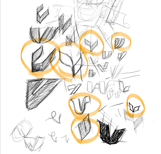
Before designing anything, we needed to find the direction the brand was heading. VerusFi had a compelling mission — but a mission alone isn't a brand. We needed to understand what kind of brand they could actually become.
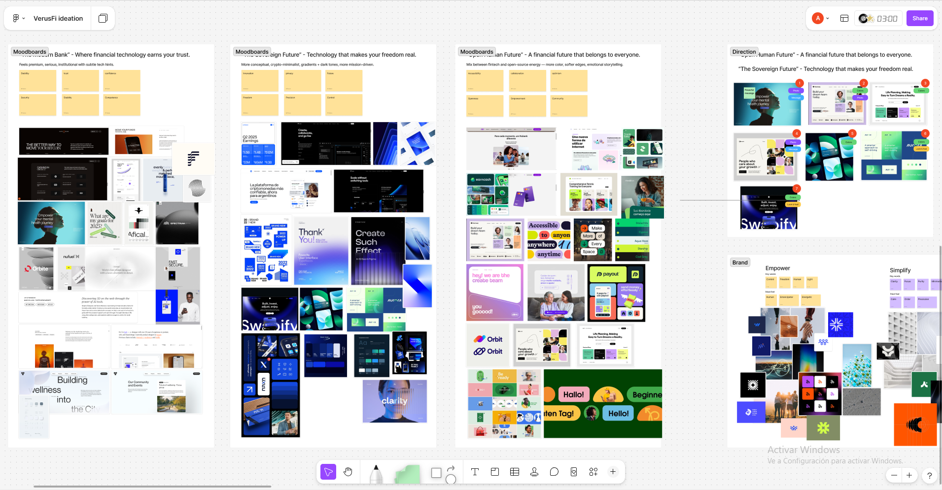
We started with moodboards — not as decoration, but as a tool for decision-making. We explored 3 different narrative and visual paths for the brand, each representing a distinct direction in terms of personality, tone, and aesthetics. For each path, we collected everything that felt related: colors, photography references, typographic styles, phrases, textures. The goal wasn't to pick the prettiest option — it was to find which direction was most honest to what VerusFi actually stood for.
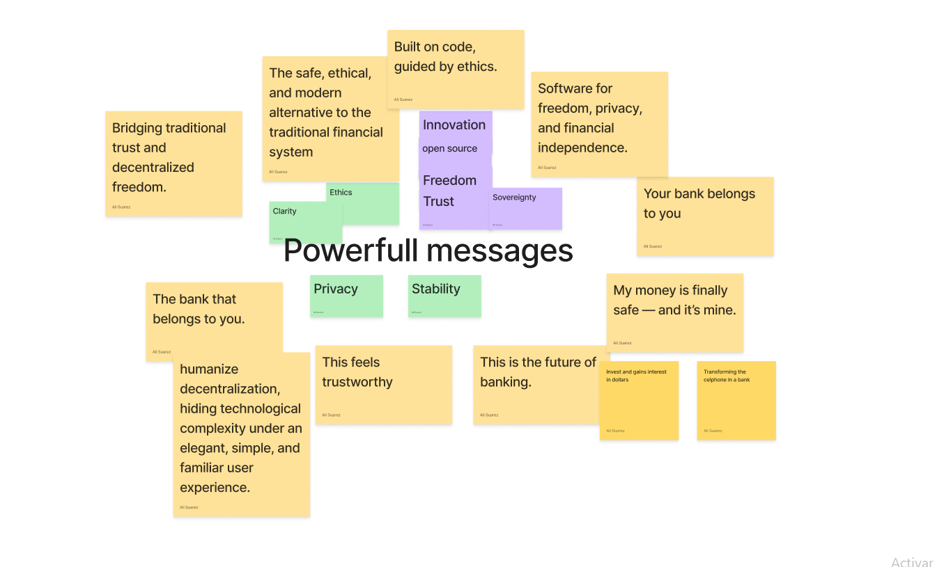
Once we had a direction, we focused on tone — what we wanted VerusFi to be, and just as importantly, what we didn't want it to be. We started with an affinity map to organize early associations, but quickly moved to something more open and intuitive: collecting words, references, and contrasts that helped the team build a shared vocabulary around the brand's voice.
- Clarity over technical correctnessPlain language. Transparency means nothing if it's buried in jargon.
- Privacy as a defaultUsers should control their data and their money — no exceptions.
- Simplicity by designRemove friction at every turn. If a feature doesn't serve the community, it doesn't ship.
- Empowerment, not gatekeepingFinance governed by the people starts with products built for the people.
 Finding the direction
 Finding the tone
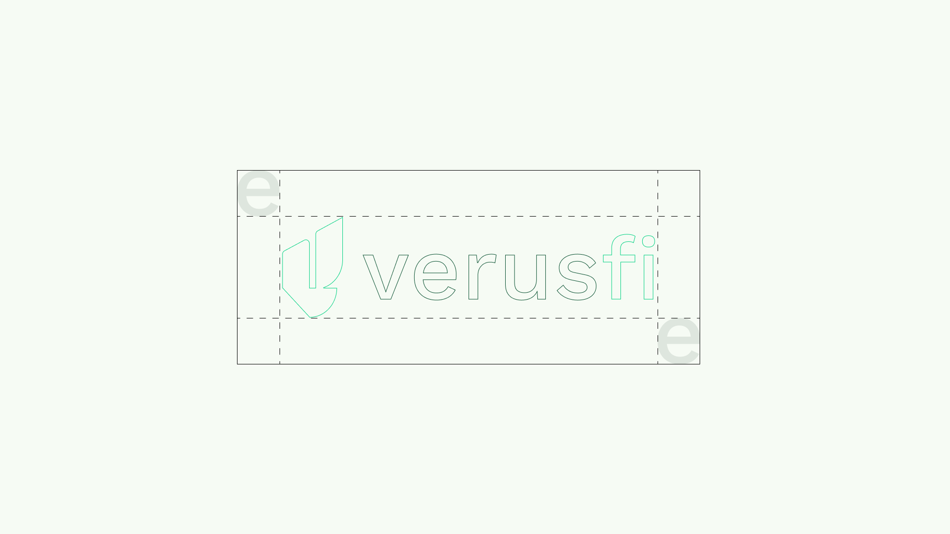
Visual identity & brand design
Once we had our positioning, the visual identity became clearer. We weren't building a "crypto brand" — we were building an ethical finance brand: open-source in its values, human in its tone, and trustworthy enough to earn a place alongside traditional banking.
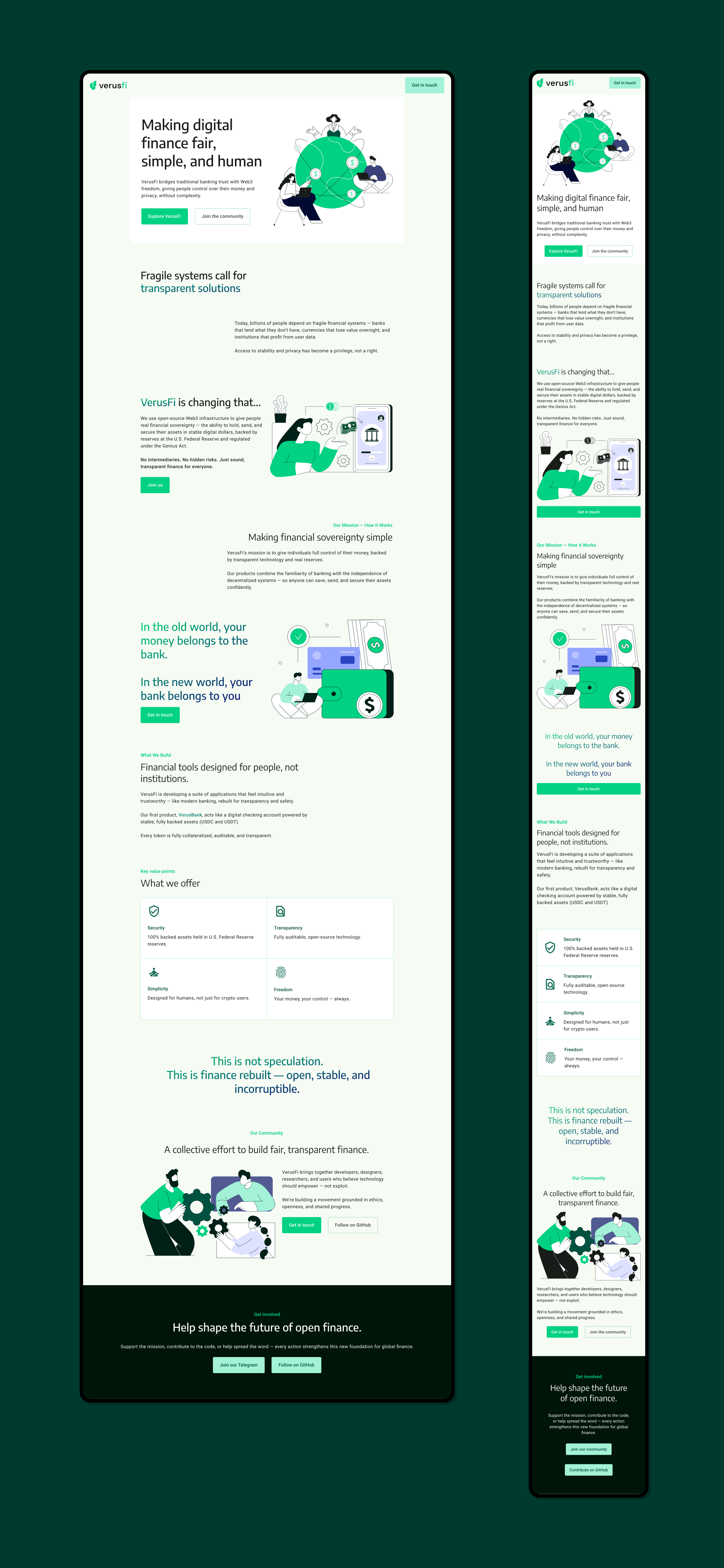
Most platforms in this space lean into cold, technical aesthetics — dark interfaces, neon accents, and design that signals exclusivity. We did the opposite. We built a palette that felt alive but trustworthy: a fresh green as the main accent — energetic, forward-moving, never aggressive — anchored by a deep navy for structure and a soft off-white background that breathes. The goal: anyone should look at a VerusFi interface and think "I could use this. This isn't designed to keep me out."
- ColorVital Pulse green as the primary accent — organic, forward-moving, never cold. Grounded by Trust Depth navy and opened up by Open Air off-white.
- TypographySans-serif, generously spaced, prioritizing readability over showiness.
- ImageryReal people and community-first scenarios — not abstract crypto imagery or exclusionary tech aesthetics.
- ToneHonest and direct — the voice of a community, not a corporation. Expert without being elitist.


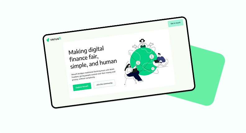
Website & web presence
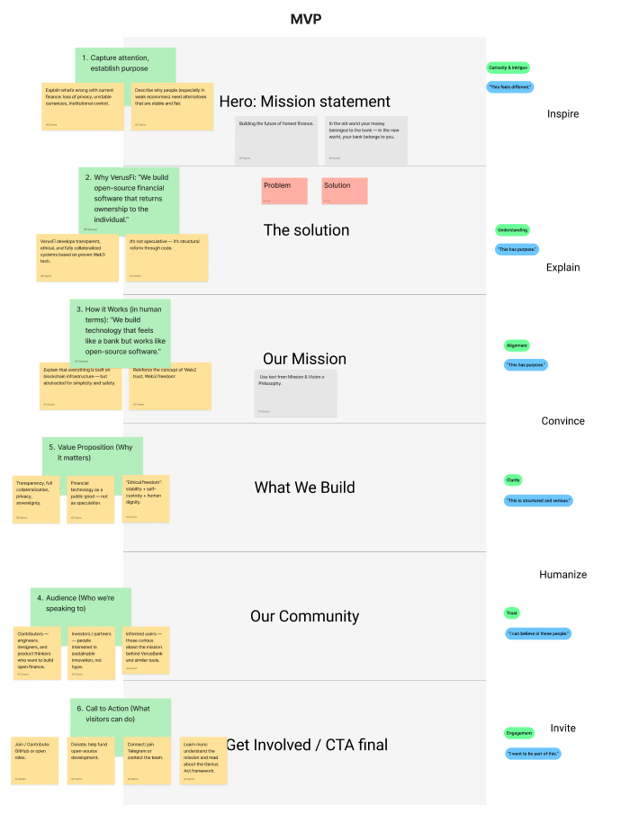
With brand and positioning defined, the challenge shifted to structure. The website had one core job: make someone who had never heard of VerusFi feel curious enough to keep scrolling.
The structure had to do the work that most DeFi sites fail at — keep the user moving forward. Every section needed to earn the next scroll: answer a question, create a new one, and never let the story stall. We weren't just laying out features — we were building a narrative that took someone from "what is this?" to "I want to be part of this."
- Hook before explanationLead with the feeling, not the feature. Give users a reason to stay before asking them to understand.
- Acknowledge the frictionName the pain points that keep people out of DeFi — then show how VerusFi is different.
- Show, don't tellUse visuals and plain language to demonstrate the product's value rather than describing it.
- Layered depthInvestors, developers, and first-time users all get enough without getting overwhelmed — each finds their entry point naturally.
 Building the narrative